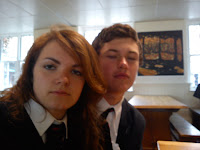
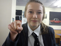
Above is my finished Shmagazine front cover. I took on-board the focus groups advice and changed all of my typography (excluding the masthead and sub heading - 'Your School Choir Needs) to a more interesting font. I also changed the main photo in the bottom right hand corner to a better, much clearer quality.
A background colour (suggested by the focus group) of pail blue really added to the piece as a whole, and demolished any bareness that the front cover may of had.
The feedback from the focus group after showing them my finished piece was positive, they particularly liked the masthead as it supplemented other elements (such as the colour schemes) nicely.
Focus Group Results
I asked a focus group of 12-13 year olds to comment on my magazine cover (first draft) and write down what they liked, disliked or what they would change etc.
This way I got plenty of useful and helpful information to improve my Shmagazine cover, and gave me a clear idea of how to create my Shmagazine contents page to a good standard.
I found these particular following comments rather helpful:
''Perhaps the style of the writing (not the title) could be a bit less boring?''
''More colour!''
''The big picture is a bit pixlated''
With the comments in mind, I set to work to produce the final front cover.
First Draft - Shmagazine Cover
This is the first draft of the Shmagazine cover. I decided to go ahead and use the typography I came across earlier as a masthead but used a clear font for the rest of the text.
I created 'Your School Choir Needs You' with a font I found on the internet which I thought looked simple and effective.
I am quite pleased with this first draft and the focus group will hopefully give me some useful feedback and good ideas to improve my magazine cover.
I created 'Your School Choir Needs You' with a font I found on the internet which I thought looked simple and effective.
I am quite pleased with this first draft and the focus group will hopefully give me some useful feedback and good ideas to improve my magazine cover.
Editing My Images
These are some of my chosen images for my front cover, and I intend to edit them to make the overall presentation of the front cover look more professional. I'd like to use picture one and two to match the appropriate headlines and picture three as my main image for the cover. I am also going to attempt to crop picture three and edit out the background so only the person in the middle is visible, this is a technique seen in many professional magazines, particularly on front covers, as seen in picture 4. It's not that I read 'Woman's Weekly' or anything...
 |
| Picture 1 |
 |
| Picture 2 |
 |
| Picture 3 |
| Picture 4 |
Typography
I have recently been looking at different fonts for mastheads of the school magazine front cover and contents page i will be creating for my pelimary task. I looked at lots of various fonts, but all of them seemed a little too basic and unprofessional for a magazine cover. So, I began to look online for some different typography and came across 'Spell with Flikr' which allowed me to spell anyword and it arranged pictures of the letters for me. I thought this looked very effective and works really nicely for my Shebbear College magazine which I have chosen to call Shmagazine. Clever hey?
Subscribe to:
Comments (Atom)


