Editing My Images
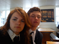
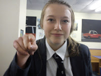
These are some of my chosen images for my front cover, and I intend to edit them to make the overall presentation of the front cover look more professional. I'd like to use picture one and two to match the appropriate headlines and picture three as my main image for the cover. I am also going to attempt to crop picture three and edit out the background so only the person in the middle is visible, this is a technique seen in many professional magazines, particularly on front covers, as seen in picture 4. It's not that I read 'Woman's Weekly' or anything...
 |
| Picture 1 |
 |
| Picture 2 |
 |
| Picture 3 |
 |
| Picture 4 |


